Full-page screenshot API explained
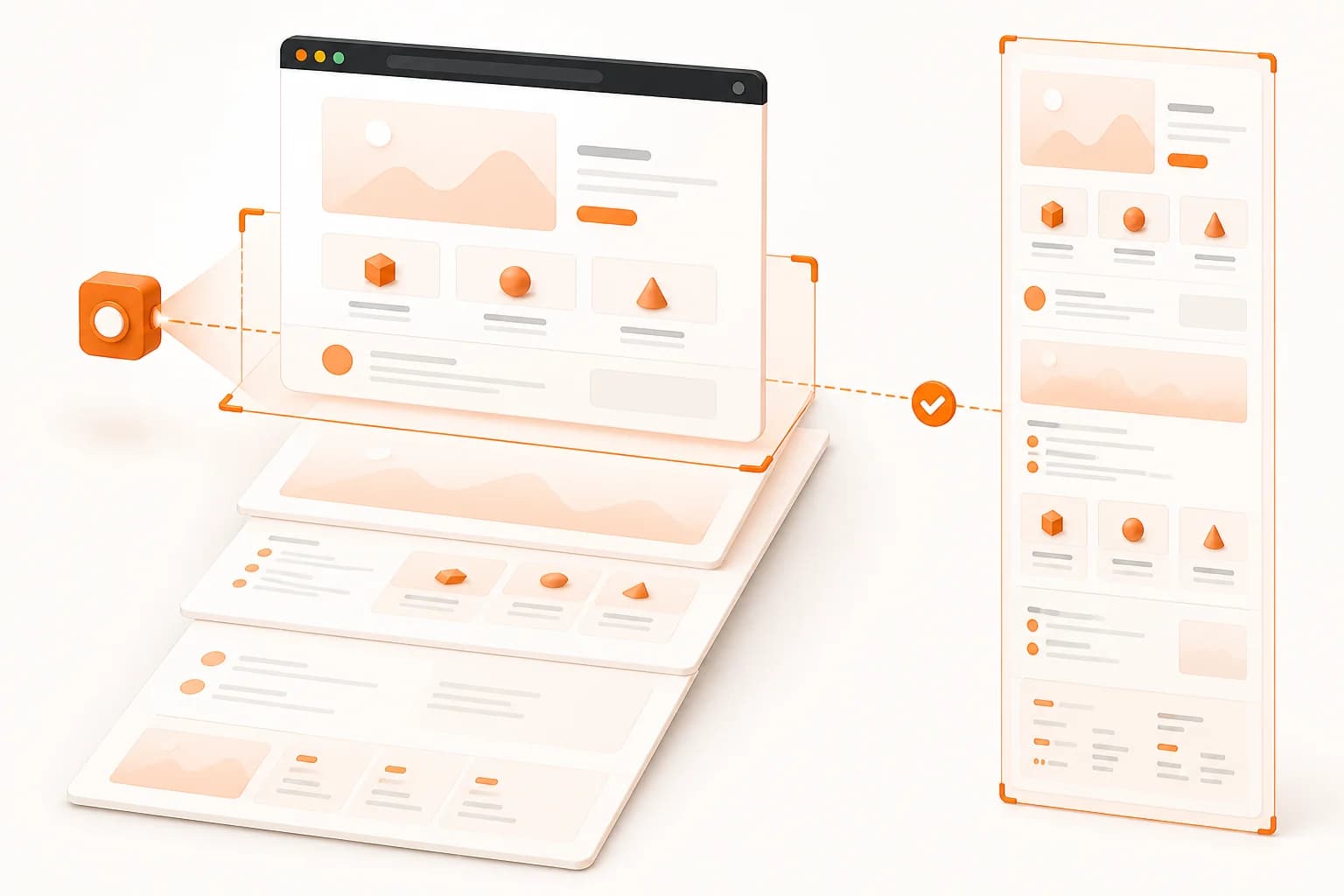
A full-page screenshot API opens a URL in a browser and records the complete scrollable document as one output. The browser still has a viewport, because width determines whether the site renders its desktop, tablet, or mobile layout. The difference is that capture continues below the visible fold until the document ends.
This is useful when the information you need is not confined to the first screen. Pricing tables, feature sections, legal footers, article conclusions, documentation examples, and calls to action often sit below the fold. A viewport capture can prove that the page loaded; a full-page capture can show whether the complete page assembled correctly.
Snapshot Site uses the same screenshot request for both modes. Set fullSize to false for the configured viewport or true for the complete document. The website screenshot API page covers the broader request model, while this guide focuses on the decisions that make long captures stable and useful.
Full-page versus viewport capture
Choose the mode according to the question the image must answer.
| Requirement | Viewport capture | Full-page capture |
|---|
| Validate the visible fold | Strong fit | Includes it, but adds more content |
| Test a responsive breakpoint | Strong fit | Strong fit when the whole responsive page matters |
| Archive an article or landing page | Incomplete | Strong fit |
| Create a compact thumbnail | Strong fit | Usually needs downstream resizing |
| Compare every page section | Partial | Strong fit with controlled settings |
A longer image is not automatically better. If a support ticket concerns a button above the fold, a viewport capture is smaller and more focused. Use full-page mode when content completeness is part of the requirement.
Width controls the responsive layout
The width parameter is part of the content specification, not only an image dimension. A page captured at 390 pixels may stack navigation, cards, and tables differently from the same page at 1440 pixels. Record the target width with every automated job so another developer can reproduce the result.
For a device-oriented matrix, combine full-page mode with the guidance on mobile screenshots. Avoid calling a desktop screenshot “mobile” after resizing it; the page must render at the intended responsive width.
Handle content below the fold
Long pages often use lazy loading to avoid fetching every image during initial navigation. Some applications also reveal blocks through animation or hydrate sections asynchronously. A browser can reach the page before those elements reach their final visual state.
Use the smallest delay that consistently allows required content to settle. Large arbitrary waits slow every job and may expose rotating banners or timers to more variation. When a fixed delay cannot describe the page reliably, use the documented endpoint options for DOM waiting and page preparation.
Fixed and sticky interface elements
A sticky header is designed to remain visible while a person scrolls. In a long automated capture, that behavior may produce a result you did not intend. Cookie dialogs and chat launchers can also cover content near the page edge.
Start with hideCookie for common consent banners. For pages you control, use stable selectors for other transient elements on endpoints that support hide. Do not hide an element merely because it creates a difference: navigation, legal notices, and sticky calls to action may be meaningful parts of the page.
Choose a format for long captures
PNG preserves fine UI edges and is a sensible input for visual comparison. JPEG can reduce file size on photographic pages but introduces lossy compression. WebP is useful for web-delivered previews when downstream systems support it. PDF is preferable when the capture belongs in a document workflow rather than an image gallery.
Keep the original output when it is evidence for QA or compliance. If a product needs a small preview, create a derivative thumbnail instead of discarding the source capture.
Practical full-page screenshot use cases
Landing page review
Growth and product teams can review a complete campaign page before traffic is sent to it. The capture includes the hero, proof sections, pricing, FAQ, final CTA, and footer in one artifact. Compare staging and production with the Visual Diff API when the goal is to identify what changed.
Documentation and knowledge bases
Long technical pages change as examples, navigation, and product interfaces evolve. A scheduled full-page capture creates a visual record that documentation teams can review without manually scrolling through every page.
Visual monitoring
Use a known-good full-page image as the baseline for a website monitoring job. Keep width, fullSize, delay, and cleanup settings identical. Otherwise, the comparison may report capture-configuration drift rather than a real page change.
Audit evidence
A complete capture can support a review workflow by showing the page state that was visible at a point in the process. Treat the image as visual evidence, not as proof of semantic HTML, accessibility, network security, or source-code correctness.
Performance and reliability practices
Full-page capture generally asks the browser to render more content than a viewport capture. Avoid requesting it when only a small region is needed. Cache results that remain valid, schedule recurring jobs at an interval justified by the page's change rate, and prevent multiple workers from capturing the same URL and configuration unnecessarily.
Check response status before reading the result. Store sanitized job context—target URL, width, format, and capture options—without logging the API key or sensitive query parameters. Retry transient failures deliberately rather than looping indefinitely.
Keep the API key in a server, worker, CI secret, or trusted automation platform. Do not expose it through browser-side JavaScript. If users can submit URLs, validate them according to your product's rules and consider an allowlist when only known domains should be captured.
Common full-page capture mistakes
- Omitting width and accepting an unintended responsive layout.
- Assuming all lazy-loaded content is complete immediately after navigation.
- Using different timing or cleanup options for screenshots that will be compared.
- Hiding sticky elements without deciding whether they are meaningful content.
- Generating a complete page for a thumbnail that only needs the first viewport.
- Exposing the API key in client-side code.
- Treating a visual capture as a replacement for accessibility or semantic testing.
Test the request in the Screenshot Generator, then move the stable configuration into raw HTTP or an official TypeScript, Python, or PHP integration.