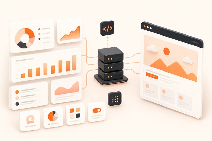
Visual Uptime Monitoring: Catching Broken Status Pages and Dashboards Before Customers Do

Snapshot Site Team
28 Apr 2026 - 03 Mins read
A classic uptime monitor pings a URL and checks the HTTP status code. That catches the page being down. It does not catch the page returning 200 OK while rendering a blank dashboard, a broken chart library, a layout that collapsed after a CSS deploy, or a status widget stuck showing yesterday's incident.
Those failures are visual, not HTTP-level, which means they need a visual check to catch — and a screenshot API is a natural fit for building one without standing up a browser fleet.
What Traditional Uptime Checks Miss
- A status page that loads but the "all systems operational" widget silently failed to update.
- A customer dashboard that returns 200 but renders an empty state because an API call is failing client-side.
- A public pricing or feature page that visually breaks after a deploy, even though every backend health check is green.
None of these trip a standard uptime alert, because the server answered correctly. The problem lives entirely in what got rendered in the browser.
Building a Simple Visual Monitor
The core idea: take a screenshot on a schedule, and compare it against a known-good baseline image using v3/compare. When the mismatch crosses a threshold, alert.
curl --request POST \
  --url https://api.prod.ss.snapshot-site.com/api/v3/compare \
  --header 'Content-Type: application/json' \
  --header 'x-snapshotsiteapi-key: YOUR_API_KEY' \
  --data '{
    "before": {"imageUrl": "https://cdn.example.com/baselines/status-page-good.png"},
    "after": {"url": "https://status.example.com", "width": 1440, "fullSize": true, "hideCookie": true},
    "threshold": 0.1
  }'
Using imageUrl for before means the baseline is a static reference image you captured once and stored, rather than a second live page — which matters here, because you specifically want to compare "what it looks like right now" against "what it looked like the last time it was confirmed healthy," not against another live capture that could be broken in the same way.
Setting Up the Schedule
Pair this with a scheduler you already run — a cron job, a GitHub Actions scheduled workflow, or an n8n workflow — firing every 5-15 minutes against the pages that matter most:
- the public status page
- the primary customer dashboard
- the login screen
- any page a broken deploy would be embarrassing on
On each run, read summary.mismatchPercentage from the response and route anything above your threshold into Slack, PagerDuty, or wherever your team already gets paged.
Refreshing the Baseline
A baseline goes stale the moment the page legitimately changes on purpose — a new feature ships, a status page gets redesigned, a chart library gets swapped. Refresh the stored baseline image right after any intentional visual change ships, otherwise the monitor starts flagging your own legitimate deploys as incidents. A simple rule that works well in practice: whenever a PR intentionally touches one of the monitored pages, regenerate its baseline as part of the merge, the same way you would update a snapshot test.
Tuning False Positives Out
Dashboards with live timestamps, rotating avatars, or streaming numbers will never compare identically to a static baseline, even when nothing is actually broken. Either widen the threshold for those specific pages, or use a hide selector on the genuinely dynamic regions before comparing — see Tuning the threshold Parameter in the Visual Diff API to Avoid False Positives for the full reasoning behind picking that number.
This kind of monitor will not replace your existing uptime tooling, and it is not meant to — it fills the specific gap where the server is healthy but the page a customer actually sees is not, which is exactly the failure mode standard monitoring is blind to. Snapshot Site makes the capture-and-compare loop cheap enough to run on a tight schedule without it becoming its own maintenance burden.
Related website monitoring resources
Combine website visual monitoring, website content monitoring, the visual diff API, screenshot scheduler, and conventional uptime checks.
Start a free visual check with one stable status or dashboard fixture.
Frequently asked questions
Does visual monitoring replace HTTP uptime checks?
No. Keep fast network and application health checks, then add rendered evidence for failures that still return a successful status.
What visual failures can it catch?
Examples include blank dashboards, missing charts, collapsed layouts, stale widgets, consent overlays, and client-side error states.
How often should a page be captured?
Choose frequency from business impact, page volatility, quota, and response time. Critical paths may need a different cadence than reference pages.
How should alert noise be controlled?
Fix viewport and readiness, define expected dynamic regions, use thresholds cautiously, and require confirmation for ambiguous differences.
What belongs in an incident record?
Keep timestamp, target identity, viewport, request settings, baseline, diff evidence, normalized status, and reviewer decision.
Can one baseline be used forever?
No. Promote a new baseline only after an authorized review and preserve baseline history so expected releases remain auditable.