Mobile vs Desktop Visual Drift: Testing Responsive Layouts with a Screenshot API

Snapshot Site Team
01 Jun 2026 - 04 Mins read
A designer tweaks the hero spacing on desktop. A developer adjusts a media query breakpoint to fix a tablet edge case. A shared component gets a padding change that "only affects the header." None of these changes look risky in review, and none of them get flagged in QA, because QA opened the page on a laptop and it looked fine.
Three days later someone opens the same page on a phone and the nav is overlapping the logo.
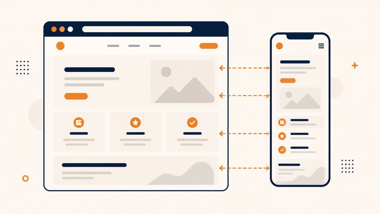
This is responsive visual drift: a layout change that regresses one breakpoint while leaving another untouched. It is one of the most common and most invisible categories of front-end bugs, because most manual review happens at a single, default width.
Why Mobile Regressions Slip Through
Responsive layouts are built from shared CSS, which means a change scoped to "fix desktop" can ripple into mobile without anyone touching a mobile-specific rule.
- Reviewers default to desktop. Pull request screenshots, staging links opened in a browser, design QA — almost all of it happens at whatever width the reviewer's monitor happens to be.
- Flexbox and grid changes are not breakpoint-scoped. A gap or min-width change written for a three-column desktop layout can reflow a stacked mobile layout in ways that are hard to predict from the diff alone.
- Media query boundaries shift. Moving a breakpoint from 768px to 800px silently changes which layout a device in that range now receives.
- Nobody screenshots every breakpoint on every change. It is not realistic to manually check five viewport widths on every commit, so most teams check one and hope.
The result is a class of bugs that passes code review, passes desktop QA, and ships straight to production.
Pick Representative Breakpoints, Not Every Viewport
You do not need to test every possible screen width — that is a losing exercise given how many devices exist. What you need is a small number of representative breakpoints that correspond to your actual CSS breakpoints:
- A mobile width, such as 390px, representing the majority of phone traffic.
- A tablet width, such as 768px, where layouts often switch from stacked to multi-column.
- A desktop width, such as 1440px, representing your primary desktop breakpoint.
Three widths, tested consistently, will catch the vast majority of real-world drift with far less overhead than trying to cover every resolution in the wild.
The Technique: Baseline Per Breakpoint, Not Mobile Against Desktop
It is tempting to think visual drift testing means comparing a mobile screenshot against a desktop screenshot to see "how different" they are. That is not a meaningful comparison — a 390px-wide capture and a 1440px-wide capture have different pixel dimensions entirely, so a pixel diff between them does not represent a layout regression, it just represents the fact that the images are different sizes.
The correct approach is to test each breakpoint against its own history, not against another breakpoint.
- Capture a baseline at each representative width. Using the screenshot API's
widthparameter, capture the same URL at 390px, 768px, and 1440px, withfullSizeenabled if you want the entire page rather than just the fold. Store all three as your baselines. - On every change, recapture at the same three widths. Same page, same widths, same
fullSizesetting. - Run the compare endpoint once per breakpoint. Compare the new 390px capture against the stored 390px baseline. Separately, compare the new 1440px capture against the stored 1440px baseline. Each comparison uses
beforeandafterat a matchingwidth, sosameDimensionscomes back true andmismatchPixelsandmismatchPercentageactually reflect layout change at that breakpoint. - Tune
thresholdper page if needed. Pages with animated or dynamic content may need a slightly higherthreshold(lower sensitivity) than static marketing pages, where you want near-zero tolerance.
Three independent diffs — mobile-vs-mobile-baseline, tablet-vs-tablet-baseline, desktop-vs-desktop-baseline — tell you exactly which breakpoint broke, without ever trying to force a comparison between two images that were never the same shape to begin with.
Wiring It Into CI or a Schedule
Once you have baselines stored per breakpoint, the check itself is cheap to run repeatedly:
- On pull requests, capture the PR's preview URL at each breakpoint and compare against the baselines from
main, so a mobile-breaking change gets flagged before merge, not after. - On a schedule, recapture production pages daily or weekly and compare against the last known-good baseline per breakpoint, catching drift introduced by third-party scripts, CMS content changes, or dependency updates rather than direct code changes.
- After intentional redesigns, refresh the stored baseline for the affected breakpoints so future diffs measure against the new correct state rather than flagging the redesign itself as a regression.
The key discipline is keeping the baseline and the check at the same width every time. Widen a breakpoint's baseline capture and forget to widen the check, and sameDimensions will simply come back false — a useful signal that something in your test setup, not necessarily your layout, has drifted.
Responsive bugs are cheap to catch and expensive to discover from a support ticket. Testing each breakpoint against its own baseline, rather than eyeballing desktop and hoping mobile follows along, is how Snapshot Site turns "looks fine on my screen" into something you can actually verify per device width.