Emulating iPhone, Android, and Tablet Screens with the Right Width and Height Presets

Snapshot Site Team
08 Apr 2026 - 02 Mins read
A common question when teams start scripting screenshots is: "how do I tell the API to capture an iPhone" or "which device should I emulate?" The honest answer is that there is no dedicated device parameter to set. The API takes two numbers — width and height — and renders exactly that viewport. Everything people call a "device preset" is really just a width/height pair worth remembering and reusing.
That is good news, not a limitation. It means the presets are yours to define once, name however makes sense for your team, and reuse consistently across every script, CI job, or asset pipeline.
A Practical Preset Table
These are the width/height combinations most teams end up hardcoding somewhere in their codebase anyway, so you may as well define them once:
| Preset name | Width × Height | Typical use |
|---|---|---|
| Phone (iPhone-class) | 390 × 844 | Mobile QA, mobile social previews |
| Phone (Android-class) | 412 × 915 | Mobile QA, Android-specific layouts |
| Tablet portrait | 768 × 1024 | Tablet QA, documentation screenshots |
| Tablet landscape | 1024 × 768 | Tablet QA, landscape app previews |
| Laptop | 1366 × 768 | The most common real-world desktop breakpoint |
| Desktop | 1920 × 1080 | Marketing screenshots, dashboards, decks |
Requesting a Preset
The request itself is a plain width/height pair, nothing more exotic:
curl --request POST \
  --url https://api.prod.ss.snapshot-site.com/api/v1/screenshot \
  --header 'Content-Type: application/json' \
  --header 'x-snapshotsiteapi-key: YOUR_API_KEY' \
  --data '{
    "url": "https://example.com/product",
    "format": "png",
    "width": 390,
    "height": 844,
    "fullSize": false
  }'
Store this table as a small constants file or config object in whichever language your automation runs in, and every capture script, doc-screenshot job, or marketing asset script can reference PRESETS.phoneIOS instead of hardcoding raw numbers in a dozen places.
What This Is Not: Resolution or Pixel Density
There is one thing worth being precise about: requesting width: 390, height: 844 reproduces the CSS layout viewport of an iPhone-class screen — the same breakpoint your responsive CSS reacts to. It does not simulate a specific device pixel ratio or retina scaling factor. If you need a higher-resolution output image for print or a marketing deck, the practical approach is to request a proportionally larger width and height directly (for example doubling both dimensions) rather than relying on a device-scale setting, since none exists.
Presets vs. Responsive QA
It is worth separating two different jobs that both start with "capture a phone-sized screenshot":
- Asset generation — you want one clean screenshot at a known size, for app store listings, docs, or a deck. This post covers that.
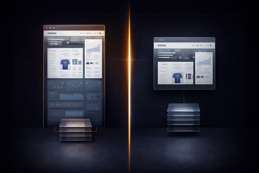
- Responsive regression testing — you want to know whether the mobile and desktop versions of a page drifted apart after a deploy. That is a comparison workflow, not a single capture, and we cover it in Mobile vs Desktop Visual Drift: Testing Responsive Layouts with a Screenshot API.
If asset generation is the goal, the same preset table pairs naturally with app store submissions — see Capturing Perfect App Store and Google Play Screenshots at Scale for the store-specific dimensions.
Once the preset table exists, adding a new device size later is a one-line change, not a scramble through old scripts — and Snapshot Site handles the rendering the same way regardless of which preset you send it.